Microsoft, on Thursday, officially announced Windows 11 – the next genre of the company’s perennial desktop operating system.
The latest version brings with it several improvements, and experts are of the opinion that finally, some of the user input has been taken into consideration.
It includes a redesigned UI, an updated window management feature, and support for Android applications.
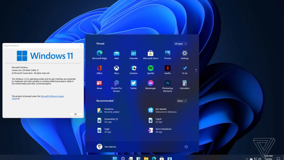
When signed in, the first thing you’d notice right off the bat is the redesigned taskbar and Start menu. Now, Windows 11 has a centred taskbar icon placement just like the macOS and has eschewed the age-old left-aligned layout of previous Windows instalments.
It, however, has retained the miscellaneous items such as the icons on the right and the clock, which leaves the left side feeling all empty.
Read Also | PSL 2021: Sarfaraz-led Gladiators look to down Sultans
As per the latest, the front and very much stand-out of this design is the new Start menu. It drops right in the middle and gives a completely redesigned UI. The new menu has placed the search bar at the top and has pinned apps and a whole bunch of recommended apps below.
Moreover, the rest of the UI has also got a fresh coat of paint. The windows now have rounded corners, which are much pronounced compared to their older versions.
The UI has more transparency now and brings back memories from Windows Vista. Themes have also been overhauled and have a more significant impact on the UI’s appearance.
Windows 11 introduces Snap Layouts, Desktop, and Snap Groups which makes it easy to rearrange multiple windows around your desktop quickly.
Windows 11 drops in after months of teases, hints, and a giant Windows 11 leak. Its support for running Android apps bringing a Mac-like universe into play.
Experts say that a lot of the UI work that was done in preparing Windows 10X is appearing in Windows 11.


